

Case Study 1
Redesign Wedding RSVP Interface
Designed primarily for the couple as a meaningful gift, while guiding guests through the celebration.
💼
Self Project
🕓
3 weeks
Role : Product Designer
February 2026
CHALLENGE
Guests struggled to quickly find essential wedding information which caused confusion and reduced engagement with the RSVP flow.
GOAL
Redesign the digital wedding invitation to prioritize key event details and increase the RSVP completion rate.

What was missing
I conducted an UI audit and competitive audit to evaluate how well the design supported guests needs.
Problems
Poor Visual Design
Poor visual hierarchy, inconsistent styles, and distracting elements made key information difficult to scan.
Unclear Navigation
The navigation and external RSVP flow created friction, while key details like the date and location were hard to find.
Mobile Usability Issues
Crowded layout, small text, and poor spacing reduced readability and required excessive scrolling.
Complicated RSVP Process
RSVP required leaving the site to complete an extra step, the process created friction and may have reduced completion rates.
Design Takeways
Prioritize clarity over decoration
Highlight key wedding informations
Create a clear RSVP flow
Improve visual hierarchy and consistency
Insights
A beautiful design alone is not enough.
For guests, the most important task is finding event details and responding quickly.
Starting The Design

Brainstorm
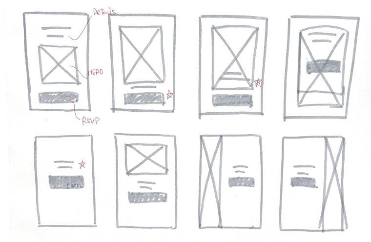
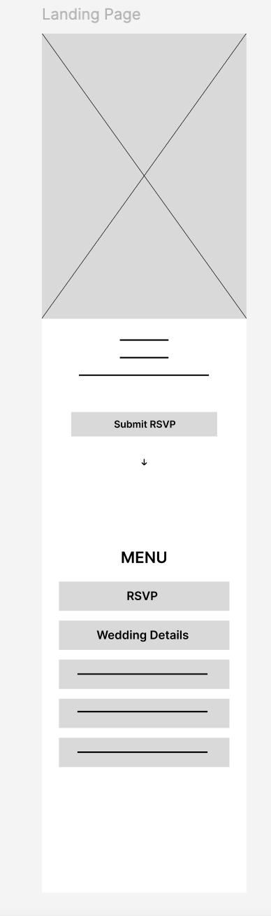

A prominent RSVP CTA emphasizes the main task and reduces drop-off.
Improved navigation through clearer structure and hierarchy.
Key event details are structured for quick scanning within seconds.
Goals
・Make event details easy to scan within 5 seconds
・Highlight the primary action (Submit RSVP)
Thoughts Process
・Placed key information above the fold for fast scan
・Used a single, high-contrast CTA to reduce indecision

Reinforce the primary RSVP action to support user flow continuity and prevent users from forgetting to complete
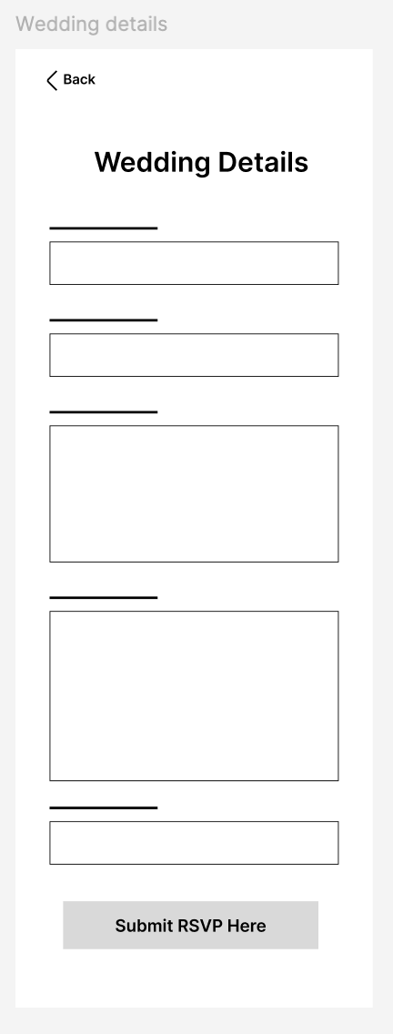
Supports guests who prefer reviewing full event details before committing.
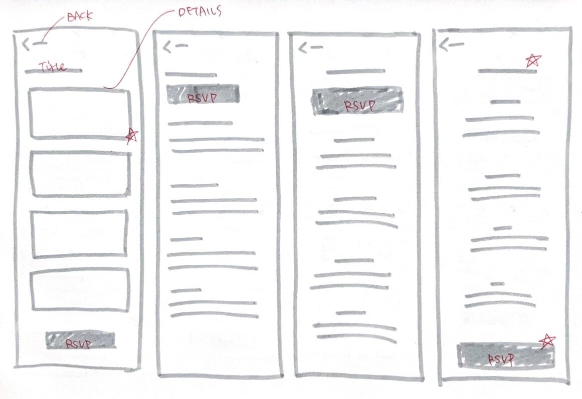
Adding the RSVP CTA at the end, encourage users when they are ready to take action.
Goals
・Increase RSVP completion rate
・Create a seamless flow from information → action
Thoughts Process
・Simple layout minimize cognitive load
・CTA repeated at the bottom prevents missed action
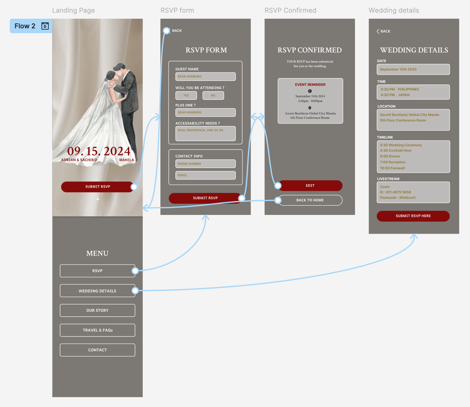
User Flow
The flow emphasizes simplicity, clear navigation, and multiple opportunities to complete the primary task.
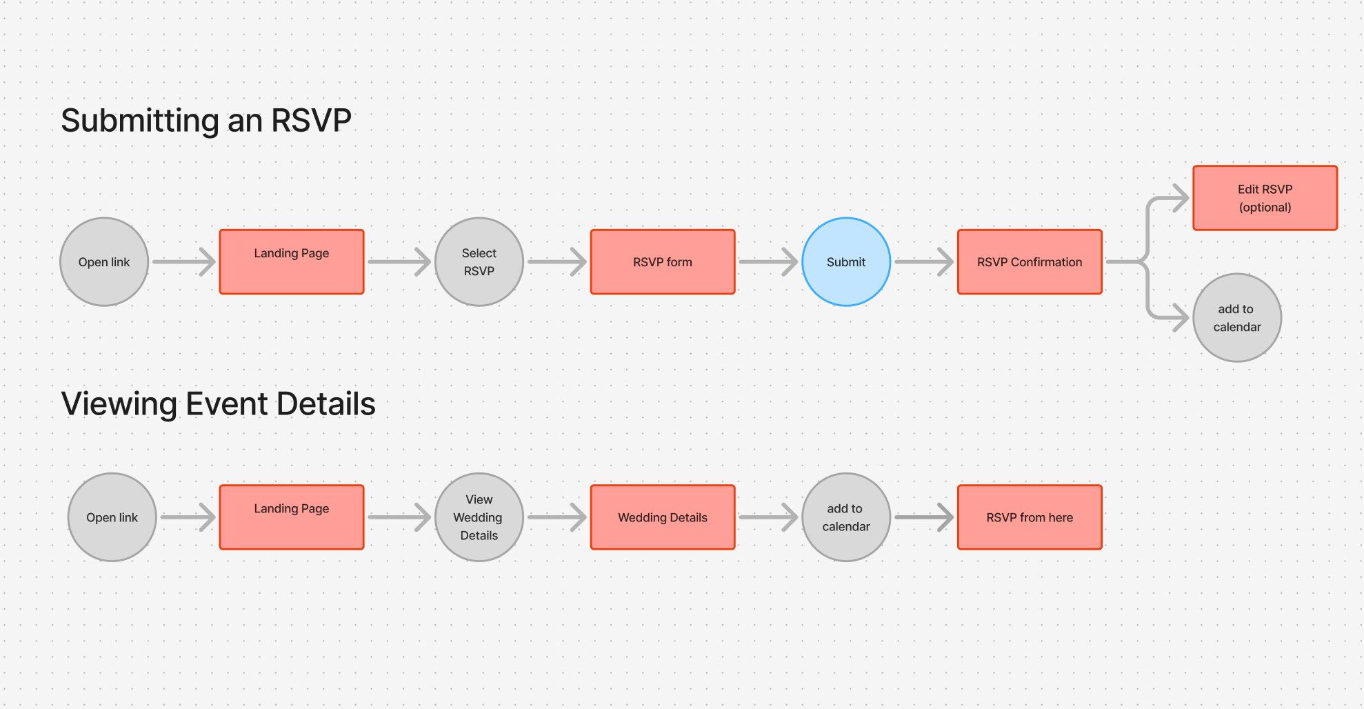
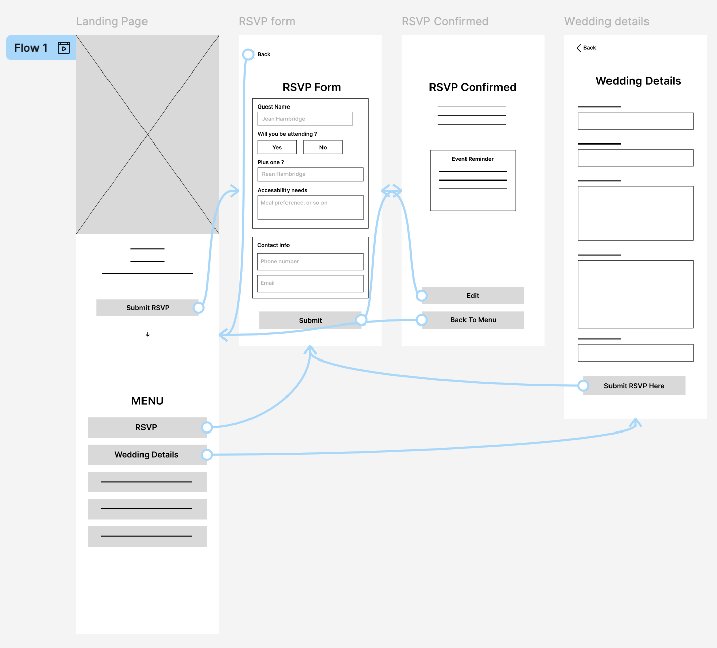
Lo-Fi Screen Flow
Refining The Design

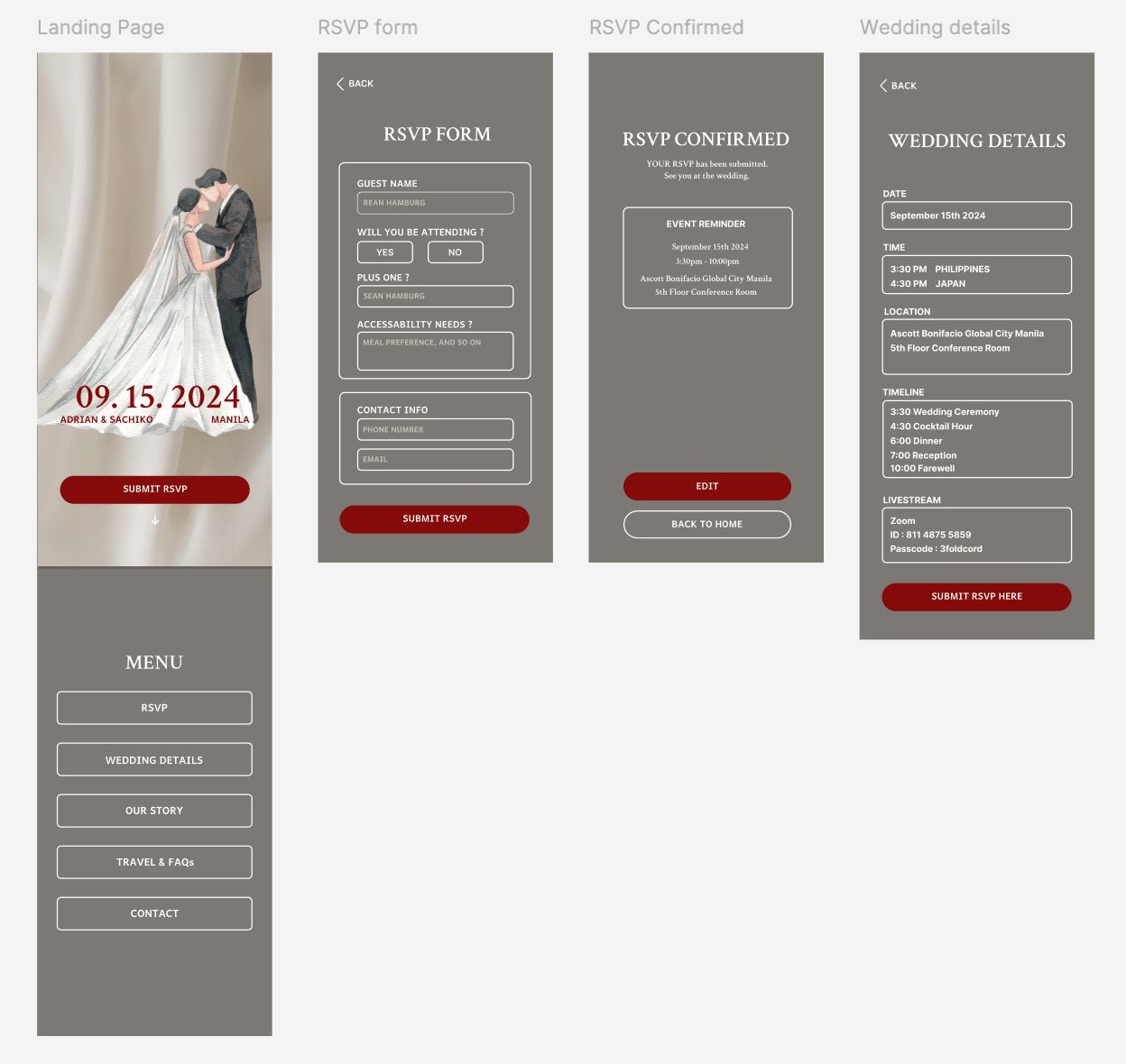
Mockups
Usability Study
I conducted a moderated usability study where participants first used the original website and then the redesigned version. The goal was to evaluate whether the RSVP CTA was clearer and positioned within a more natural user flow.
Findings
RSVP CTA clearly communicates
the website’s main purpose. Placing the RSVP CTA prominently on the landing page helped users quickly understand the primary action of the site. Participants were able to identify what to do next without confusion.
The event reminder section creates friction instead of support. The reminder content felt visually dense and less emphasized, making it harder to scan. Instead of reinforcing the event details, the amount of information added cognitive load.
Weak visual hierarchy on the wedding detail page.
Titles and body text appear similar in size and color, reducing easy scan and cause details Unidentifiable
Before
After
Goals
・Reinforce key event details
・Ensure the reminder supports not competes
Thoughts Process
・Reduced clutter through spacing and grouping
・Used icons help users process information faster
Before
After
Goals
・Reduce overload when reviewing event details
・Help users quickly distinguish titles from content
Thoughts Process
・Increased contrast between section titles and body
・Added spacing and structure to guide the eye
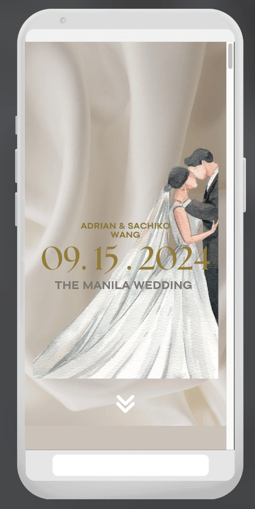
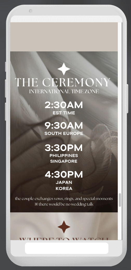
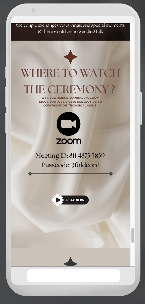
Hi-fi Protoype
Project Takeaways
This experience deepened my understanding of user-centered design, which leads to clearer decisions and more intuitive user experiences.
Learnings
Reinforced the importance of designing from the guest’s perspective.
By reviewing my earlier work through an UI audit helped me prioritize user needs over personal design preferences.
Every design decision should have a clear purpose. Visual elements and interactions must support meaningful engagement, not act as decoration.
Structuring user flows logically is essential. Anticipating what users expect next creates a more intuitive and frictionless experience.
Next Steps
Introduce subtle motion to enhance engagement.
Add light animations to increase guest engagement while maintaining visual balance and avoiding distraction.
Refine the “About Us” section for clarity
and readability. Improve content structure, spacing, and hierarchy to maintain brand personality while reducing visual noise and enhancing readability.
Integrate the “Leave a Message” feature within the product. Allow guests to submit messages directly within the website instead of redirecting to an external link, reducing friction and keeping the experience seamless.
© 2026 Harunainbloom
Projects
Case Study 1
+81 90 1912 0506
Case Study 2
seancespring@gmail.com
More questions ?
Case Study 1
Redesign Wedding RSVP Interface
Designed primarily for the couple as a meaningful gift, while guiding guests through the celebration.
💼
Self Project
🕓
3 weeks
Role : Product Designer
February 2026
CHALLENGE
Guests struggled to quickly find essential wedding information which caused confusion and reduced engagement with the RSVP flow.
GOAL
Redesign the digital wedding invitation to prioritize key event details and increase the RSVP completion rate.
What was missing
I conducted an UI audit and competitive audit to evaluate how well the design supported guests needs.
Problems
Poor Visual Design
Poor visual hierarchy, inconsistent styles, and distracting elements made key information difficult to scan.
Unclear Navigation
The navigation and external RSVP flow created friction,
while key details like the date and location were hard to find.
Mobile Usability Issues
Crowded layout, small text, and poor spacing reduced readability and required excessive scrolling.
Complicated RSVP Process
RSVP required leaving the site to complete an extra step, the process created friction and may have reduced completion rates.
Design Takeways
Prioritize clarity over decoration
Highlight key wedding informations
Create a clear RSVP flow
Improve visual hierarchy and consistency
Insights
A beautiful design alone is not enough.
For guests, the most important task is finding event details and responding quickly.
Starting The Design
Brainstorm

A prominent RSVP CTA emphasizes the main task and reduces drop-off.
Improved navigation through clearer structure and hierarchy.
Key event details are structured for quick scanning within seconds.
Goals
・Make event details easy to scan within 5 seconds
・Highlight the primary action (Submit RSVP)
Thoughts Process
・Placed key information above the fold for fast scanning
・Used a single, high-contrast CTA to reduce decision fatigue

Reinforce the primary RSVP action to support user flow continuity and prevent users from forgetting to complete it.
Supports guests who prefer reviewing full event details before committing.
Adding the RSVP CTA at the end, encourage users when they are ready to take action.
Goals
・Increase RSVP completion rate
・Create a seamless flow from information → action
Thoughts Process
・Simple layout minimize cognitive load
・CTA repeated at the bottom prevents missed action
User Flow
The flow emphasizes simplicity, clear navigation, and multiple opportunities to complete the primary task.
Lo-Fi Screen Flow
Refining The Design
Mockups
Usability Study
I conducted a moderated usability study where participants first used the original website and then the redesigned version. The goal was to evaluate whether the RSVP CTA was clearer and positioned within a more natural user flow.
Findings
RSVP CTA clearly communicates the website’s main purpose.
Placing the RSVP CTA prominently on the landing page helped users quickly understand the primary action of the site. Participants were able to identify what to do next without confusion.
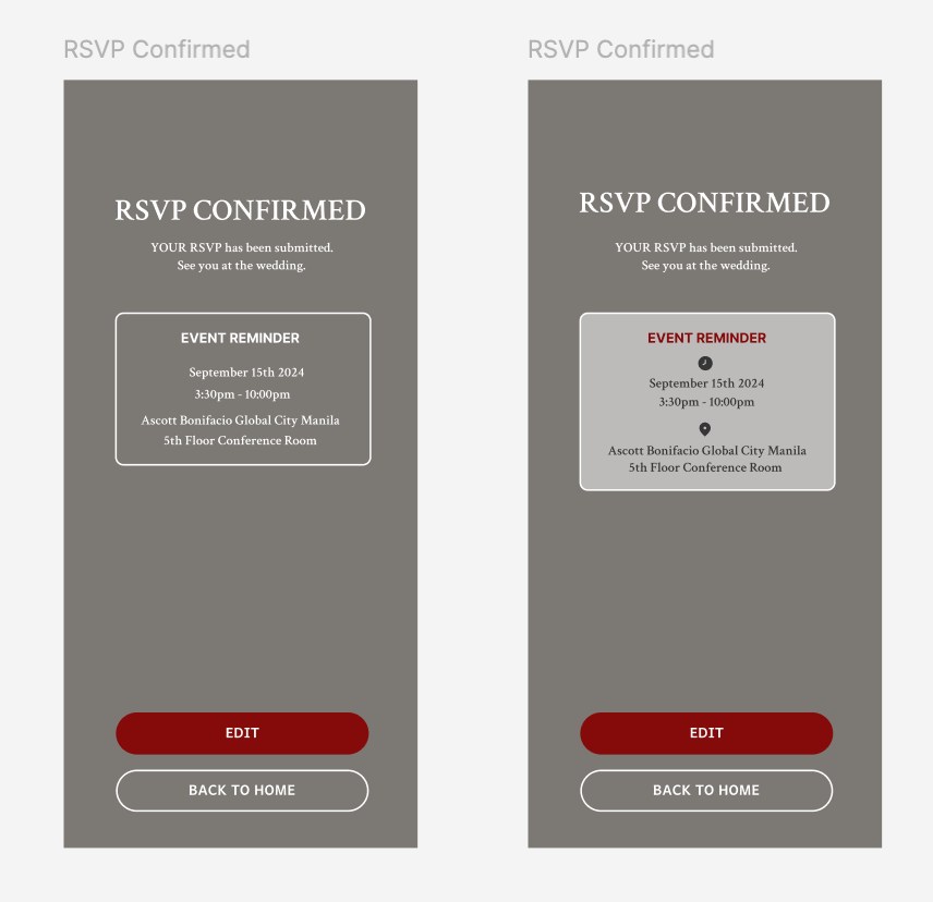
The event reminder section creates friction instead of support.
The reminder content felt visually dense and less emphasized, making it harder to scan. Instead of reinforcing the event details, the amount of information added cognitive load.
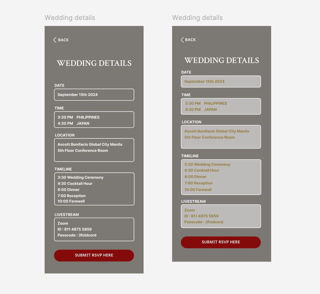
Weak visual hierarchy on the wedding detail page.
Titles and body text appear similar in size and color, reducing easy scan and making key details harder to identify.
Before
After
Goals
・Reinforce key event details (date, time, location)
・Ensure the reminder supports not competes
Thoughts Process
・Reduced visual density through spacing and grouping
・Used icons help users process information faster
Before
After
Goals
・Reduce cognitive load when reviewing event details
・Help users quickly distinguish titles from content
Thoughts Process
・Increased contrast between section titles and body
・Added spacing and structure to guide the eye
Hi-fi Protoype
Project Takeaways
This experience deepened my understanding of user-centered design, which leads to clearer decisions and more intuitive user experiences.
Learnings
Reinforced the importance of designing from the guest’s perspective.
By reviewing my earlier work through an UI audit helped me prioritize user needs over personal design preferences.
Every design decision should have a clear purpose.
Visual elements and interactions must support meaningful engagement, not act as decoration.
Structuring user flows logically is essential.
Anticipating what users expect next creates a more intuitive and frictionless experience.
Next Steps
Introduce subtle motion to enhance engagement.
Add light animations to increase guest engagement while maintaining visual balance and avoiding distraction.
Refine the “About Us” section for clarity and readability.
Improve content structure, spacing, and hierarchy to maintain brand personality while reducing visual noise and enhancing readability.
Integrate the “Leave a Message” feature within the product.
Allow guests to submit messages directly within the website instead of redirecting to an external link, reducing friction and keeping the experience seamless.
Case Study 1
Redesign Wedding RSVP Interface
Designed primarily for the couple as a meaningful gift, while guiding guests through the celebration.
💼
Self Project
🕓
3 weeks
Role : Product Designer
February 2026
CHALLENGE
Guests struggled to quickly find essential wedding information (date, venue, RSVP)
which caused confusion and reduced engagement with the RSVP flow.
GOAL
Redesign the digital wedding invitation to prioritize key event details and increase the RSVP completion rate.

What was missing
I conducted an UI audit and competitive audit to evaluate how well the design supported guests needs.
Problems
Poor Visual Design
Poor visual hierarchy, inconsistent styles, and distracting elements made key information difficult to scan.
Unclear Navigation
The navigation and external RSVP flow created friction,
while key details like the date and location were hard to find.
Mobile Usability Issues
Crowded layout, small text, and poor spacing reduced readability and required excessive scrolling.
Complicated RSVP Process
RSVP required leaving the site to complete an extra step, the process created friction and may have reduced completion rates.
Design Takeaways
Prioritize clarity over decoration
Highlight key wedding informations
Create a clear RSVP flow
Improve visual hierarchy and consistency
Insights
A beautiful design alone is not enough.
For guests, the most important task is finding event details and responding quickly.
Starting The Design

Brainstorm
Goals
・Make event details easy to scan within 5 seconds
・Highlight the primary action (Submit RSVP)
Thoughts Process
・Placed key information above the fold for fast scanning
・Used a single, high-contrast CTA to reduce decision fatigue


A prominent RSVP CTA emphasizes the main task and reduces drop-off.
Improved navigation through clearer structure and hierarchy.
Key event details are structured for quick scanning within seconds.
Goals
・Increase RSVP completion rate
・Create a seamless flow from information → action
Thoughts Process
・Simple layout minimize cognitive load
・CTA repeated at the bottom prevents missed action
Reinforce the primary RSVP action to support user flow continuity and prevent users from forgetting to complete it.
Supports guests who prefer reviewing full event details before committing.
Adding the RSVP CTA at the end, encourage users when they are ready to take action.
User Flow
The flow emphasizes simplicity, clear navigation, and multiple opportunities to complete the primary task.
Lo-Fi Screen Flow
Refining The Design
Mockups
Usability Study
I conducted a moderated usability study where participants first used the original website and then the redesigned version. The goal was to evaluate whether the RSVP CTA was clearer and positioned within a more natural user flow.
Findings
RSVP CTA clearly communicates the website’s main purpose.
Placing the RSVP CTA prominently on the landing page helped users quickly understand the primary action of the site. Participants were able to identify what to do next without confusion.
The event reminder section creates friction instead of support.
The reminder content felt visually dense and less emphasized, making it harder to scan. Instead of reinforcing the event details, the amount of information added cognitive load.
Weak visual hierarchy on the wedding detail page.
Titles and body text appear similar in size and color, reducing easy scan and making key details harder to identify.
Goals
・Reinforce key event details (date, time, location)
・Ensure the reminder supports not competes
Thoughts Process
・Reduced visual density through spacing and clearer grouping
・Used icons help users process information faster
Before
After
Goals
・Reduce cognitive load when reviewing event details
・Help users quickly distinguish titles from content
Thoughts Process
・Increased contrast between section titles and body
・Added spacing and structure to guide the eye
Before
After
Hi-fi Prototype
Project Takeaways
This experience deepened my understanding of user-centered design, which leads to clearer decisions and more intuitive user experiences.
Learnings
Reinforced the importance of designing from the guest’s perspective. By reviewing my earlier work through an UI audit helped me prioritize user needs over personal design preferences.
Every design decision should have a clear purpose.
Visual elements and interactions must support meaningful engagement,
not act as decoration.
Structuring user flows logically is essential.
Anticipating what users expect next creates a more intuitive and frictionless experience.
Next Steps
Introduce subtle motion to enhance engagement.
Add light animations to increase guest engagement while maintaining visual balance and avoiding distraction.
Refine the “About Us” section for clarity and readability.
Improve content structure, spacing, and hierarchy to maintain brand personality while reducing visual noise and enhancing readability.
Integrate the “Leave a Message” feature within the product.
Allow guests to submit messages directly within the website instead of redirecting to an external link, reducing friction and keeping the experience seamless.
© 2026 Harunainbloom
Projects
Case Study 1
+81 90 1912 0506
Case Study 2
seancespring@gmail.com
More questions ?